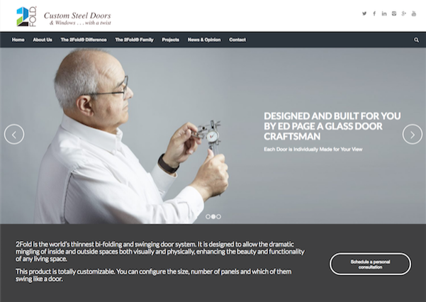
Project Description
Problem: Ed Page was looking for a clean and precise looking website to reflect the quality and style of his glass doors. The various site pages needed to describe the materials and craft of his work, and to showcase his projects. Finally, the site needed to be easy for the visitor to navigate.
Solution: We explored different typographic systems. The goal was to have the fonts and headings be easy to read, and to support the minimalist aesthetic of the doors themselves. Quick links were added to the Home page, highlighting the materials with which the doors are made.

