Project Description
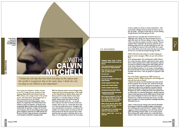
Problem: The Federal Reserve Bank of New York wanted to redesign their internal publication. They wanted the page layouts to be more dynamic, yet still maintain a clarity in the magazine’s overall organization. This involved creating different styles for the departments, features and columns to help the readers to easily navigate through the magazine.
Solution: We created different layout styles based on whether the content of the magazine fell under the category of department, feature or column. This distinction would help the readers easily navigate the publication. At the same time the use of recurring visual elements — such as the section tabs on the left and right margins of the page spreads — helped to give the piece an overall coherence.

